TEAM MEMBER: CHORONG PARK, JOE HAN, YIBO PAN
Duration: 2019 October - 2019 November
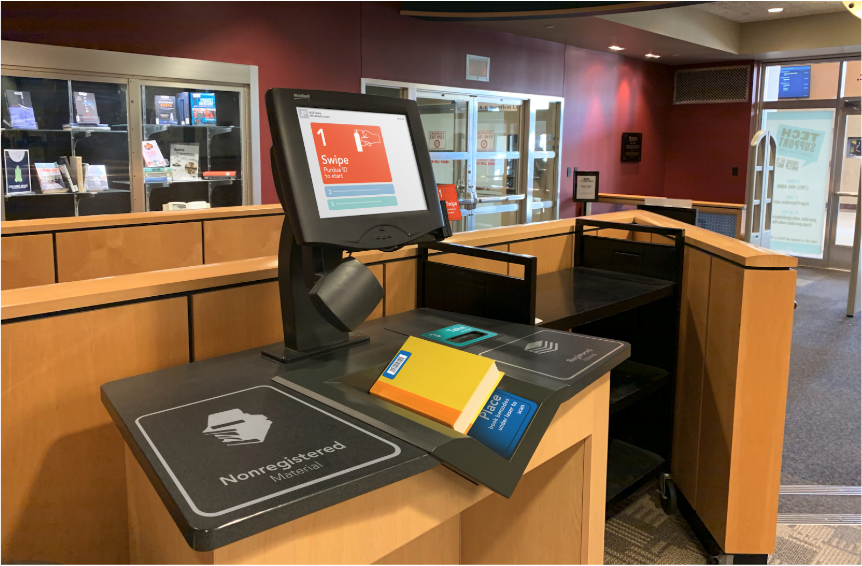
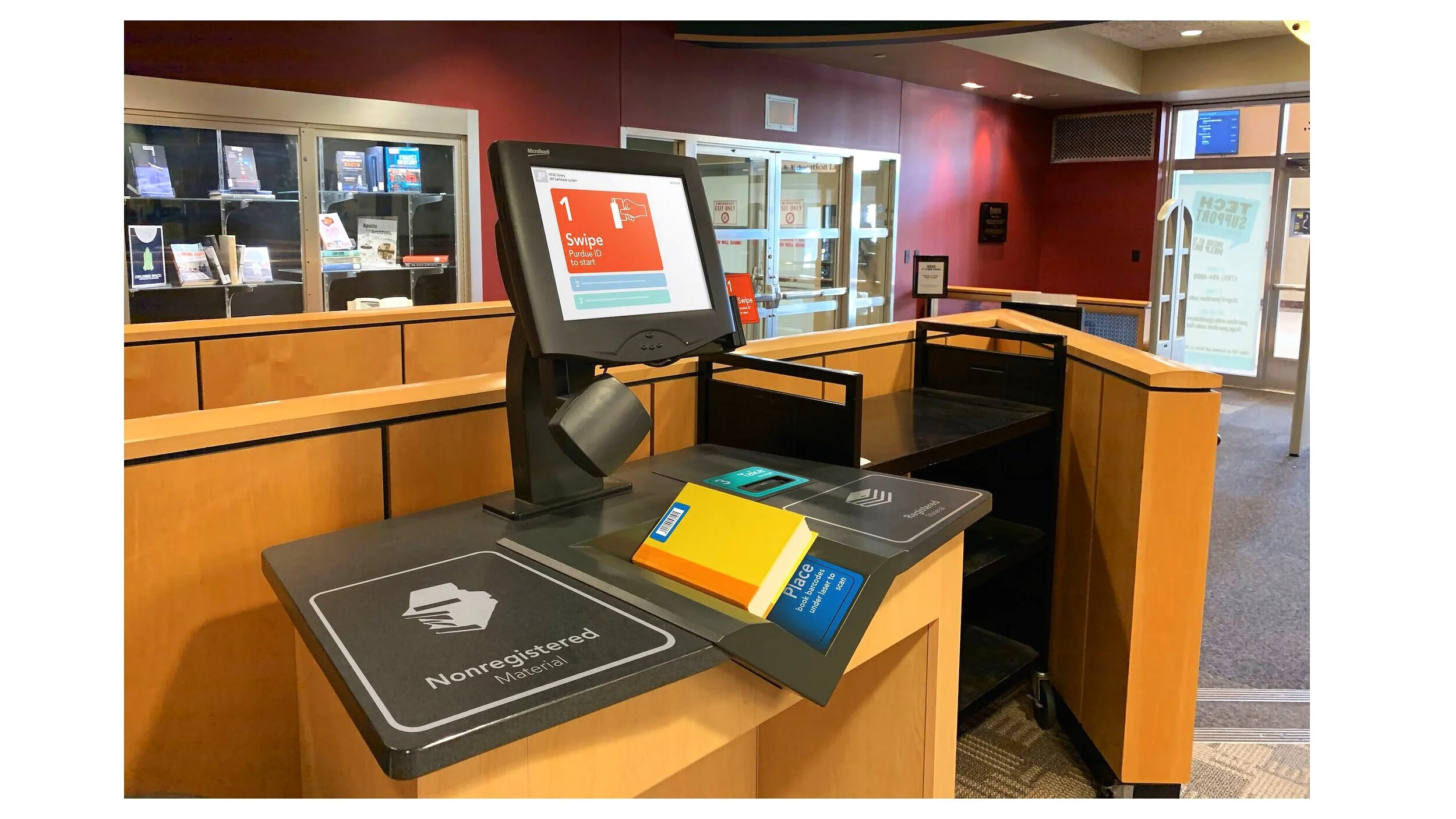
The goal of this project is redesigning the kiosk system in the Purdue library for better user flows, and interaction.
THE ORIGINAL DESIGNKIOSK AT PURDUE LIBRARY
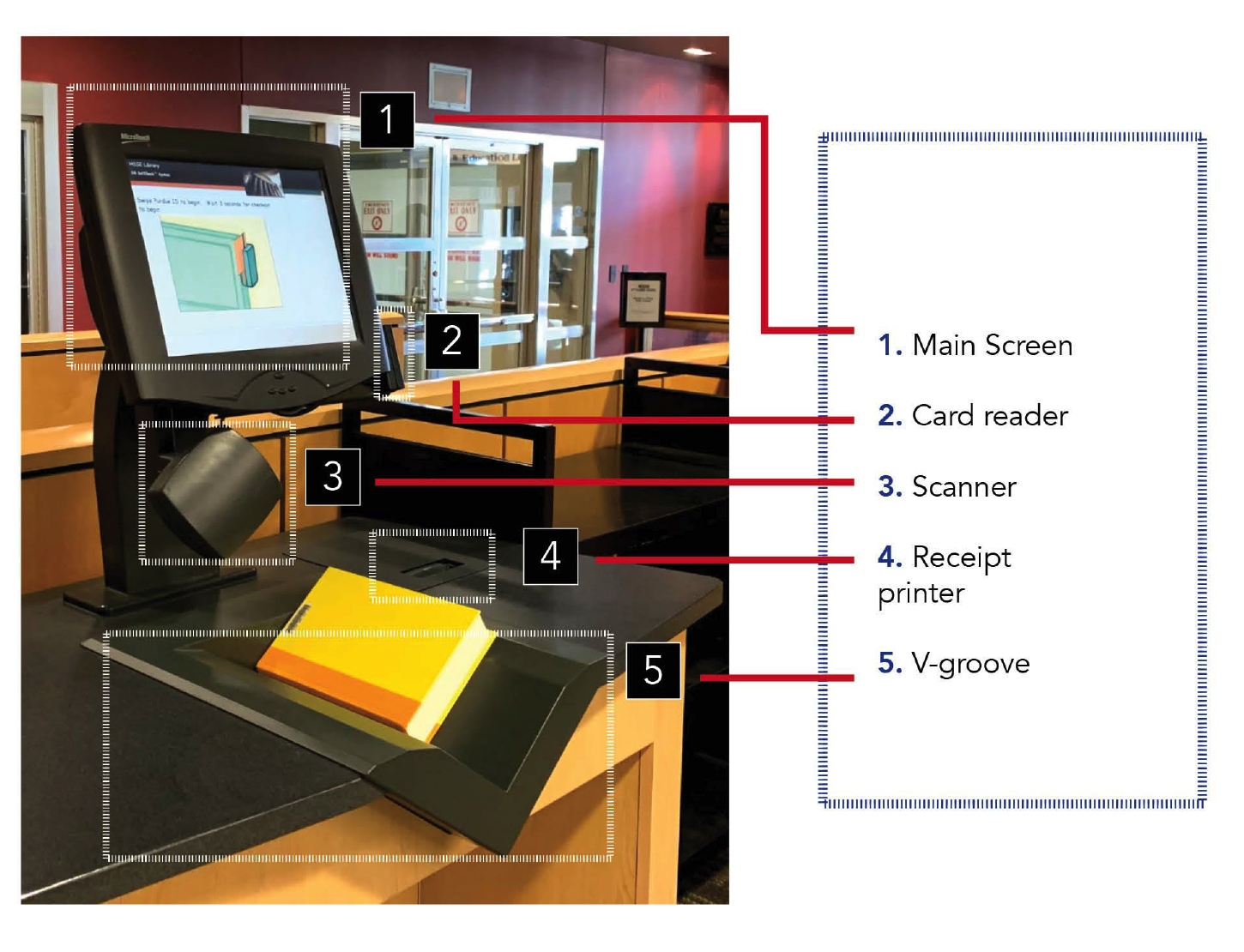
With no description of the each numbered objects, outdated and unorganized system have been increased the frustration between library users.
THE CHALLENGEWHAT IS THE PROBLEM?
Our goal for the project was to raise the accessibility for the self checkout kiosk machine at the Purdue library. Even though there were only three steps, swipe your ID card, scan, and take receipt, there were a lot of confusion interacting with the kiosk machine.
Our ambitions were to redesign the application of kiosk machine that embraced a rapid evolving library system with upgraded user centered design.
Our high level goals were to
“Find the problems of the self-checkout kiosk with field study and bottom-up analysis.”
Simplifies the process that confuses user.
Create the visual design that helps user to understand the process.
Make it fast and easy to use for everyone.
MY ROLE
I collaborated with two other designers to work on the projects. Generating ideas for the prototyping, taking notes for the interview, analyzing the date with Atlas and coming up with the new design of application was my role.
KCIKOFFGETTING THE INFO
All of us had idea of what is the library auto check machine. Nevertheless, the kiosk machine is quite different that any other machine we have used in the past. It confused us with unclear and complexed use flow.
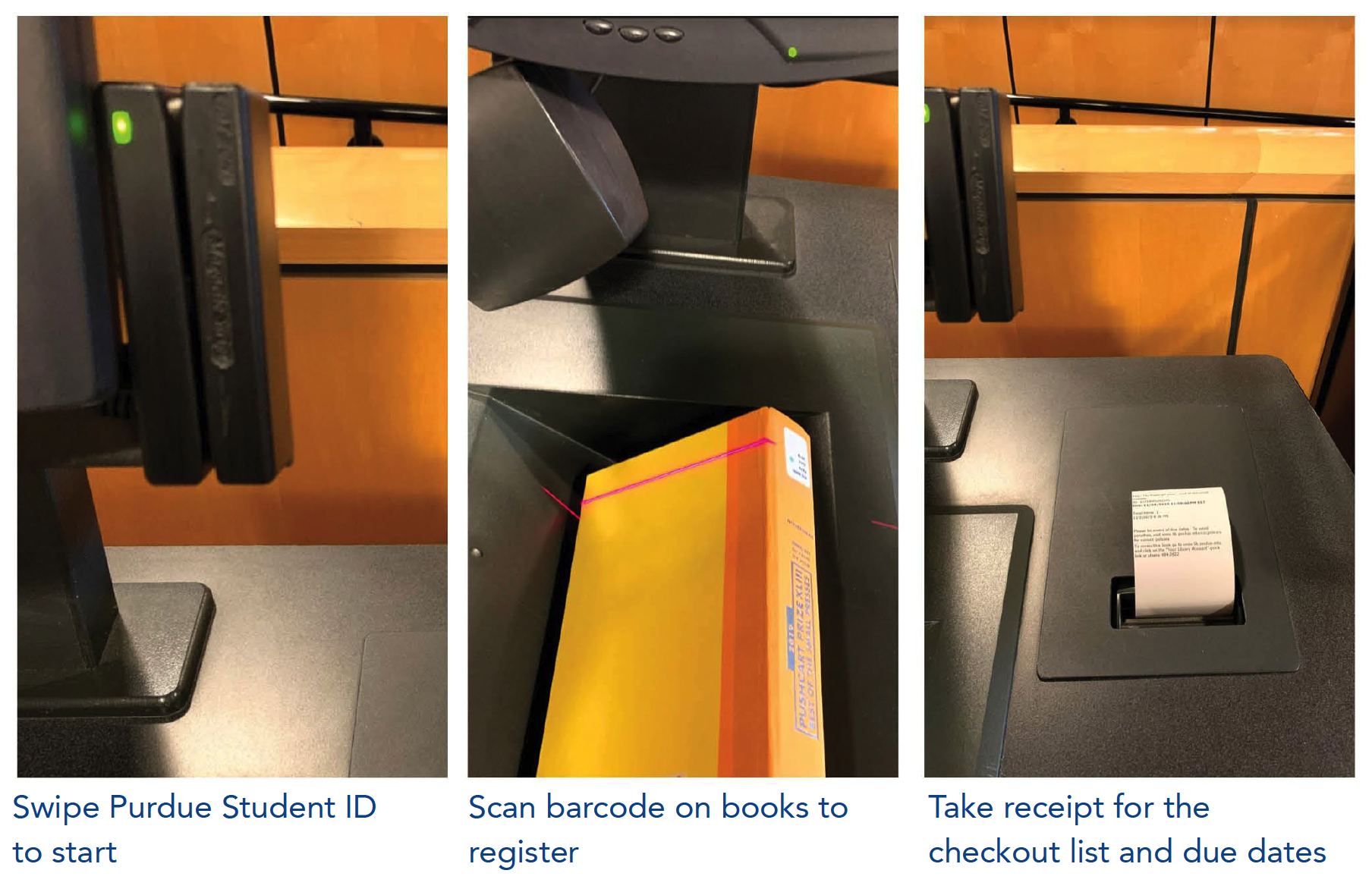
It seems pretty simple, because it has only three simple steps to finish from the outside. Nevertheless, as you see below, the entire process is not clear nor easy.
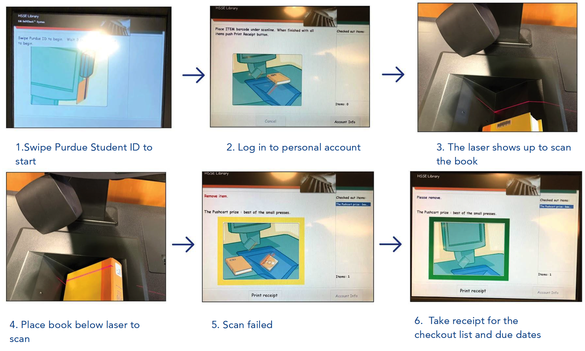
Each steps gave user the outdated graphics with unclear user feedback. Therefore, users got confused to figure out what to do for next.
DISCOVERYWHAT WE HAVE FOUND
I was surprised that we have found 47 problems on performance, 55 for software, 16 for system when user interacts with the kiosk machine. It supposed to help people to check in/out the book easily. Instead it was creating more confusion.
"The bad design create miscommunication, time consumption, and stress"
Great user experience design harmonizes software, hardware, and the system into the whole. This was the beginning of our journey.
KEY INSIGHTSDATA ANALYZATION
Prior to the redesign, we had to focus on what kind of difficulties user have frequently. We planned to find out the problem and redesign the entire kiosk system in a week.
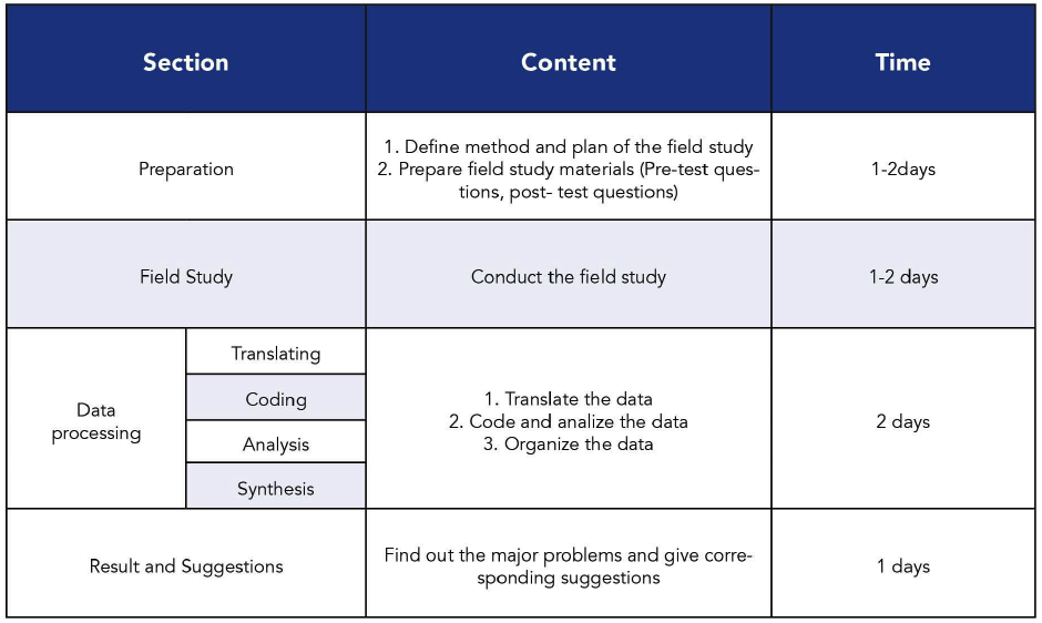
FIELD STUDY
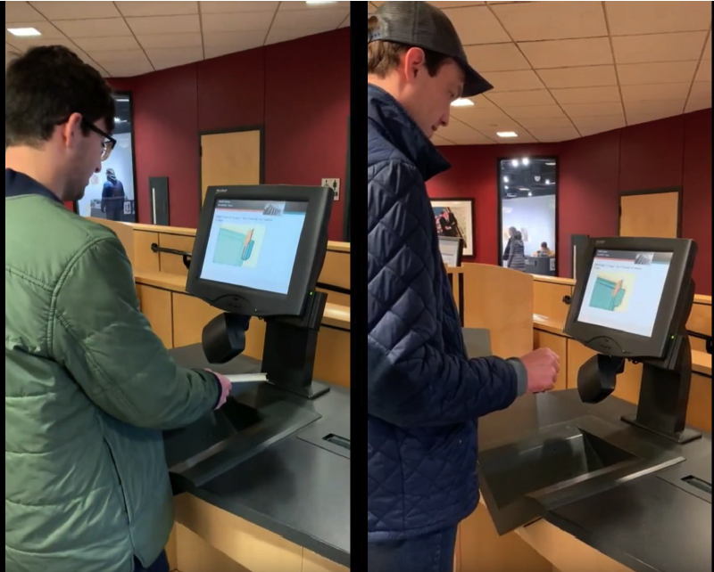
Used a bottom up observation method and interviewed 5 people who randomly used the machine. We also video and audio recorded the process with a camera.
2. DATA ANALYSIS
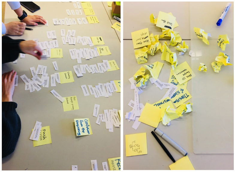
We started to analyze the data from the field study using coding, triangulation, and synthesis.
Digging into the data revealed some chunk of insights into the library kiosk machine experience. Most of the participants were confused and took extra time to figure out what is the next step to follow. The data showed that the experience was neither convenient nor fast for the users. The most confusion occurred with the graphics on the screen or instruction of how to scan the book with V-groove.
3. CODING AND TRIANGULATION
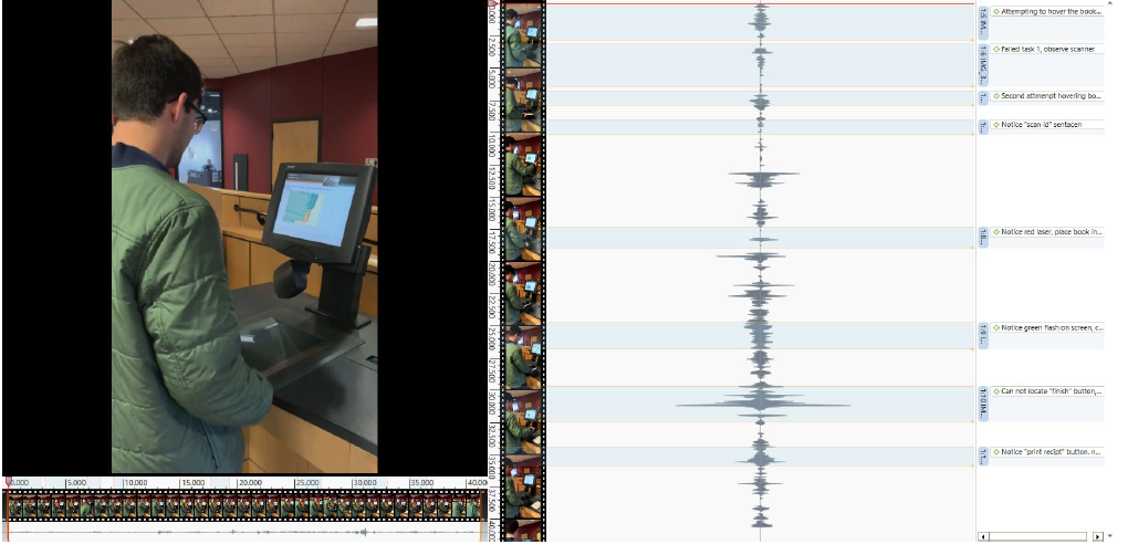
Based on our recording, we gathered all the important comment from users and categorized them.
Our team got
132 codings (assorted comments) in total.
4. PROBLEM CATEGORIZATION
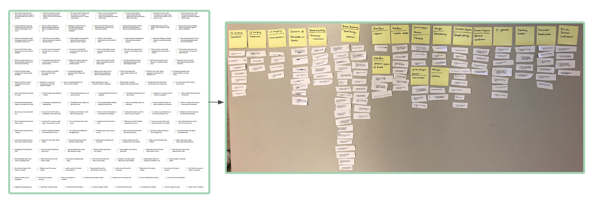
The time and energy we spent figuring out the problem during problematic check-in situations was worth it. With bottom-up approach, we have figured out the hardware, software, and the system were connected to each other and creating confusion, which can be solved easily.
5. DIMENSION CATEGORIZATION
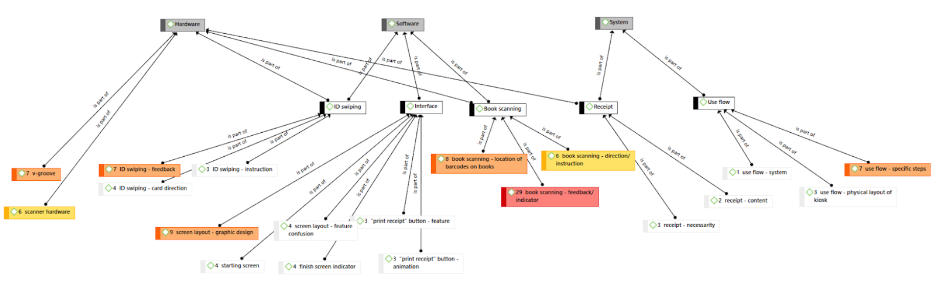
The biggest question was how can we minimize confusion that occurred during the process of checking out. From the beginning of the swiping the id card to log in to receive the receipt, the 8 colored steps were the ones that frequently mentioned during the checkout process. The book scanning creates the most confusion for the users.
6. DIMENSION ANALYSIS
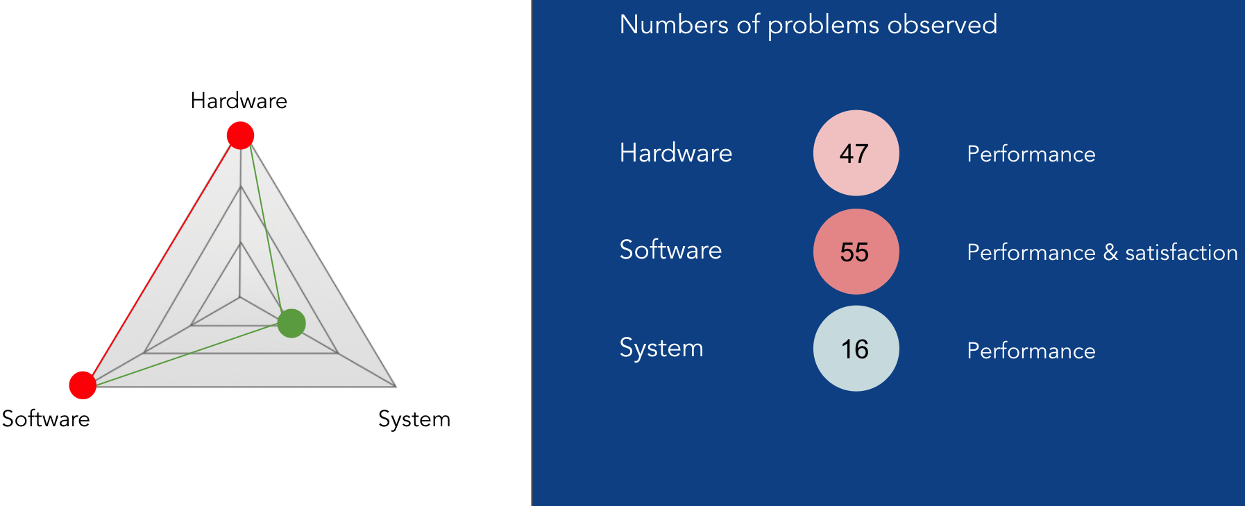
Number of problems are observed all areas. The problems were focused on the hardware and software.
The hardware, software and system have to work together. Neither of them cannot be designed poorly, because they are connected like a spider web.
7. FREQUENCY ANALYSIS IN BAR GRAPH
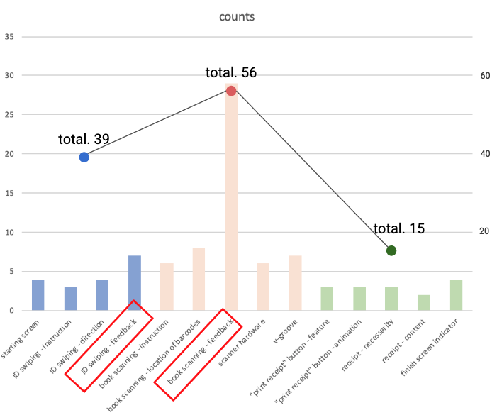
Through out the entire process, the compressed three steps for the checkout are:
User login
Book registration
Info output & checkout
The first two steps caused most of the problems. To be specific, lack of output (feedback) information from the machine caused the biggest problems for the first two steps.
8. KEY INSIGHTS
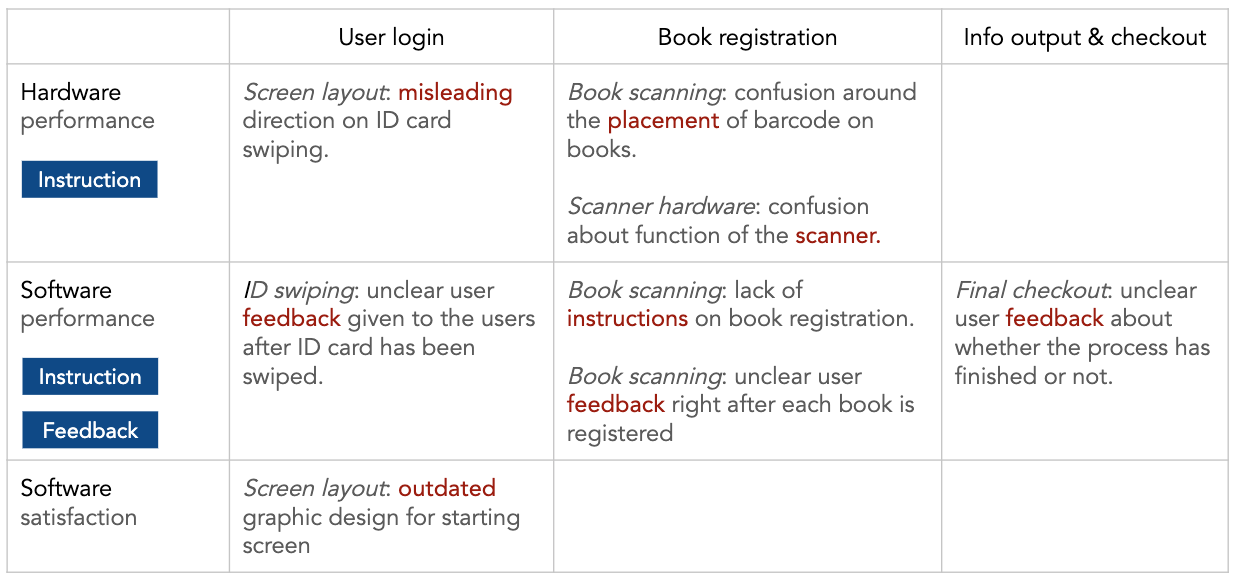
Based on the analysis, we were able to summarize the key insights, the most important but confused steps, which is the most important information we got to redesign the kiosk machine efficiently.
DESIGN SUGGESTIONTHE EASY, FAST, CONVENIENT CHECKOUT FOR EVERYONE
A major reason problematic hesitation/confusion occurred was because of getting unclear instructions on almost every step. Without much debate, the team agreed to make clear instructions which would increase user flow.
1. ID SWIPING
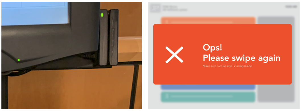
From the first step, we have found two problems. It was giving unclear user feedback given after ID card has been swiped. Moreover, screen layout: misleading direction on ID card swiping
Provide an obvious visual feedback when ID card scan failed
2. OUTDATED DESIGN FROM INITIATION
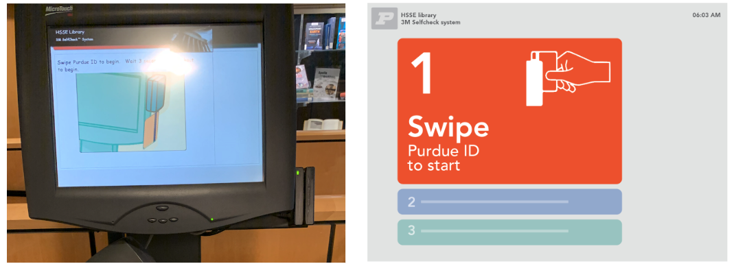
The users rely on the outdated graphic design which has unnecessary information and images. To provide easy and simple step by step instruction, the new design focused on simplicity.
3. DESIGN FOR SIMPLE THREE STEPS
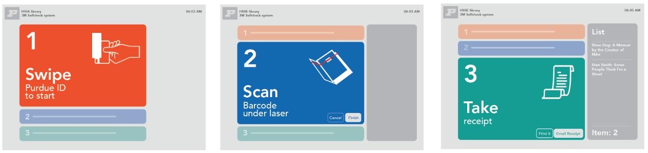
While users going through each step, the lack of instructions on book registration arouse confusion as well as around final checkout. Color coding was used for each step on digital interface as well as each key locations on kiosk for users to draw connection. Therefore, providing a clear instruction of the process was achieved with redesign.
DEEPER INSIGHTWHAT ELSE NEEDS TO BE DONE ?
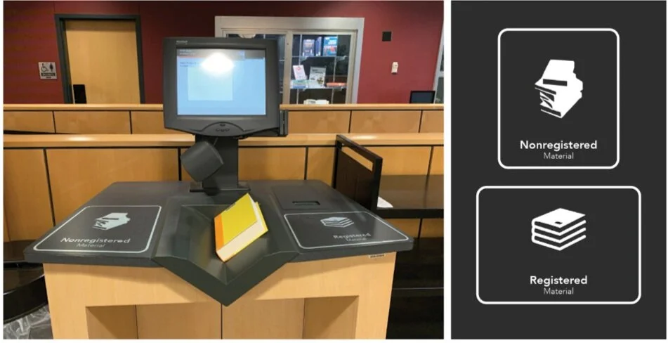
We started to gain deeper insight while understanding what is the problem with the entire kiosk machine, including software, hardware and the system. We came up with an idea that adding more indication for the book scanning. As providing designated zones for unregistered and registered books, users have the option to organize their books using the zone marks on kiosk.
UNCLEAR USER FEEDBACK ON SCANNING
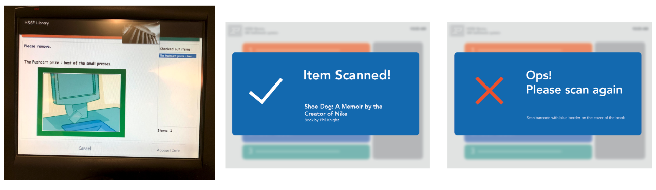
The more we dig into the system, the more things to fix showed up. One of the most problem is that unclear user feedback was given right after each book is registered. The redesign provided an obvious visual feedback when ID card scan failed during the process of book registration.
HOW TO SCAN THE BARCODE ON THE BOOK BETTER?
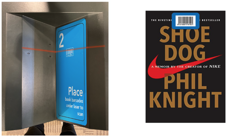
To make better user flow, redesigning clear and direct graphic for scanning barcode was required. Color of the label was selected as blue to match with the 2nd step that is shown on the screen.
UPGRADED DESIGN ON HARDWARE
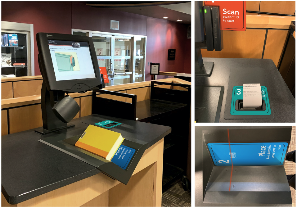
THE FINAL DESIGNINSPIRING CONFIDENCE ON THE CONFIRMATION SCREEN
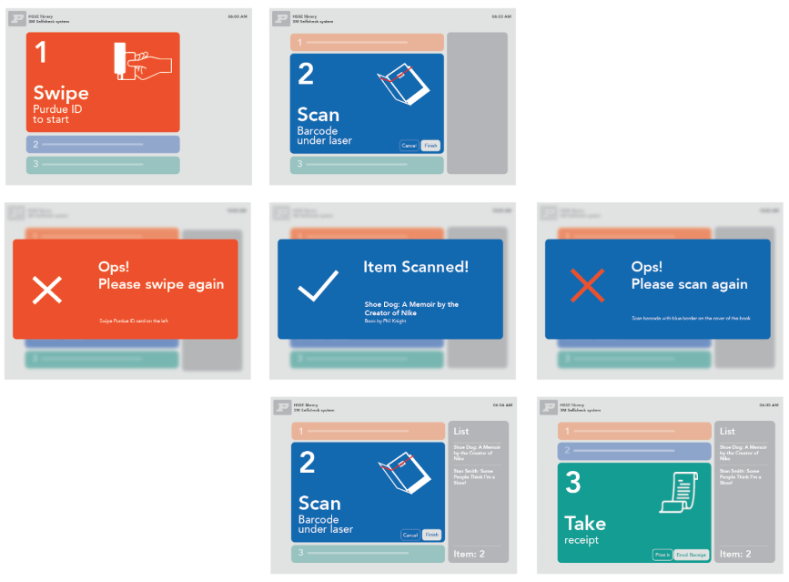
If the new experience was to do the heavy lifting on behalf of the user, the confirmation screen needed to boost confidence and show how the checkout experience was being taken care of. Therefore, the redesign has been focused on giving clear feedback on each step.
A key design challenge was to consider how much information needs to be given for each step.
If there are too many steps, or too much information on each step, user will get confused.
A critical part of the checkout experience is that users have a clear understanding of what to proceed next, user flow. The existing old checkout system didn’t do a good job of supporting the user flow, relying mostly on the user to figure out the next step with incorrect information given on the screen.
THE FINAL DESIGN